
Colour is rarely just decoration. In Buddhist traditions spanning thousands of years, every shade carries weight, meaning, and intention, functioning as what you might call a spiritual language written directly into the visual world. A saffron robe, a gold-leafed statue, a cobalt lotus painted across a silk thangka — each of these is a deliberate choice, rooted in teachings about the mind, the elements, and the path toward awakening. Understanding this language gives you something far more useful than a colour palette. It gives you a framework for creating a home that feels genuinely settled, calm, and alive with quiet purpose.
Key Takeaways
| Point | Details |
|---|---|
| Colour carries deep meaning | Each hue in Buddhism is tied to spiritual ideas that influence mindfulness and mood. |
| Practical décor guidance | Applying Buddhist colour symbolism in your home fosters harmony and serene energy. |
| Traditions vary by region | Colour use in Buddhism shifts with school and geography, offering rich choices for personal spaces. |
| Intention is key | Mindful use of colour—beyond strict rules—ensures your space feels both authentic and uniquely yours. |
Understanding colour symbolism in Buddhism
To understand why colour matters in Buddhist-inspired spaces, we first need to explore the roots of its symbolism. Buddhism does not use colour as decoration in the ordinary sense. Across its many traditions, colour functions as a form of spiritual technology, a way of encoding complex philosophical ideas into sensory experience that practitioners can absorb, meditate upon, and embody over time.
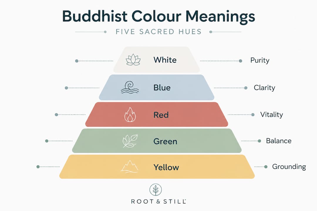
The most structurally rich system comes from Tibetan Vajrayana Buddhism, where five primary colours are associated with the Five Dhyani Buddhas, each linked to specific elements, directions, wisdoms, and the transformation of particular mental poisons into liberating awareness. White represents the wisdom of the dharmadhatu, the pure all-encompassing expanse, connected to Vairocana and associated with the east or centre. Blue is linked to Akshobhya and the mirror-like wisdom that reflects reality without distortion. Yellow carries the wisdom of equanimity through Ratnasambhava. Red corresponds to Amitabha and the wisdom of discernment. Green, assigned to Amoghasiddhi, embodies the all-accomplishing wisdom that drives compassionate action into the world.
“Each of the five colours is understood not merely as a visual quality but as a vehicle for transforming the mental poisons that obscure our true nature — ignorance, aversion, pride, desire, and envy — into their corresponding wisdoms.”
This is a profound reframe. Rather than treating colour as a mood board choice, this system invites you to think about what quality you are trying to cultivate. A space built around blue is not simply calming by accident. It is, in the Tibetan framework, an invitation to mirror-like clarity and stillness.
Monastic robe traditions show just how broadly this thinking extends. Robe colours vary by tradition: saffron and orange in Theravada communities across Southeast Asia reflect simplicity, renunciation, and wisdom; maroon and deep red in Tibetan Buddhism point toward transformation and compassion; yellow appears in certain South Asian and Indian communities as a symbol of light and knowledge. None of these choices are arbitrary. Each emerged through a combination of available dyes, cultural context, and philosophical meaning, making colour a living expression of mindfulness and home harmony in every setting where it appears.
| Colour | Associated Buddha | Element | Wisdom |
|---|---|---|---|
| White | Vairocana | Space | Dharmadhatu wisdom |
| Blue | Akshobhya | Water | Mirror-like wisdom |
| Yellow | Ratnasambhava | Earth | Equanimity wisdom |
| Red | Amitabha | Fire | Discriminating wisdom |
| Green | Amoghasiddhi | Air | All-accomplishing wisdom |
How Buddhist colour symbolism is applied
Now that the meanings are clear, let’s see how these colours manifest in real Buddhist practice and culture. Colour appears in three broad areas: the physical objects of practice (robes, statues, ritual implements), the visual arts (thangka paintings, mandalas, temple murals), and the inner landscape of meditation itself.
In Theravada practice, colour-kasina meditation involves concentrating on a single pure colour, such as a disc of vivid blue, as an object of sustained attention. The practitioner holds the colour in mind even with eyes closed, developing a sharp, unwavering focus that then becomes the basis for deeper states of meditation. Blue is particularly valued for its ability to quiet mental agitation. This is not a small detail. It means that blue, as a colour in a room, carries a cultural and contemplative resonance that runs very deep.
The lotus motif is perhaps the most widely recognised symbol in Buddhist art, and its colour variations carry very specific meanings. Lotus colours symbolise: white for purity and spiritual perfection, pink for the highest enlightenment embodied by the Buddha himself, blue for the wisdom that rises above the senses, red for compassion and the open heart of love, and purple for the more esoteric and secret teachings of Tantric Buddhism. When you place a lotus motif in your home, the colour you choose is not incidental. It is a statement about the quality you wish to bring forward.
In terms of ritual objects and statuary, colour is equally deliberate. A Red Buddha statue carries the energy of Amitabha — warmth, discernment, and the boundless compassion of the western direction. A blue Buddha Feng Shui set speaks to clarity and mirror-like stillness. Even framed pieces like blue brocade Buddha art can hold this quality, anchoring a wall with a presence that feels both calm and considered.
Pro Tip: If you are drawn to a particular Buddha colour but unsure why, sit with that feeling. In Buddhist thought, attraction to a specific colour can indicate which quality your mind is naturally seeking — clarity, warmth, peace, or vitality. Let that draw guide your choice.
Ritual objects such as prayer wheels, offering bowls, and fabric altar cloths are also deliberately coloured. Monks preparing altars for ceremonies will often arrange offering cloths in the five colours, representing the five directions and five wisdoms simultaneously. This attention to colour as a complete spiritual system, not merely decoration, is what makes the tradition so rich for mindful décor.
Contrasts and nuances: Variation across schools and regions
With deeper context, it’s also important to understand that not all Buddhist colour meanings are set in stone. One of the most important things to carry with you is an awareness that Buddhist colour symbolism is a living tradition, not a fixed rulebook, and it varies considerably across cultures, schools, and centuries.
Theravada Buddhism, dominant across Sri Lanka, Thailand, Myanmar, and Cambodia, focuses primarily on the practical and ethical dimensions of colour in monastic life. Regional robe colours vary significantly: Chinese monastic communities often wear grey or black robes, with richer colours reserved for ceremonial occasions and different shades signifying seniority or rank. In Tibetan Buddhism, colours are woven into an entire cosmological system of elements, Buddhas, and directions, giving every hue a specific cosmic address.
“In Balinese Buddhist-influenced traditions, the directional colour associated with the north shifts to black, whereas in Tibet the same direction is assigned green — a reminder that even within a shared philosophical inheritance, local interpretation shapes meaning.”
This is actually a gift for you as someone creating a mindful home environment. It means you are not bound to one tradition’s palette. A green Buddha Feng Shui set draws on the Tibetan association with accomplishment and vitality, while a piece of carefully chosen yoga wall art from a different visual tradition can sit alongside it without contradiction, provided your intention is clear and respectful.
Mahayana Buddhism, which encompasses Zen traditions in Japan, Chan in China, and Korean Seon, tends to strip back colour in favour of natural materials and monochromatic simplicity. Unpainted wood, raw stone, and undyed linen are valued precisely because they do not impose a symbolic overlay. They give the space room to breathe. This minimalist approach to colour is itself a statement: restraint and silence can be as powerful as saturation.
Understanding these differences helps you make more confident choices. You are not trying to replicate a specific tradition. You are drawing on a rich inheritance and translating it into your own space with honesty and care.

Shop Now: Med Standing Buddha
Having understood foundational and regional distinctions, you’re ready to bring this symbolism into your daily surroundings. The practical application of Buddhist colour wisdom in the home is less about strict adherence and more about developing a thoughtful, intentional relationship with the colours you choose.
For meditation areas or spaces where you want to encourage stillness and mental clarity, incorporating white and blue creates an atmosphere that feels genuinely restful. White softens the room, opening it to a sense of spaciousness, while blue grounds that openness in a quality of cool, mirror-like calm. A teal Buddha statue can serve as a focal anchor in such a space, its colour sitting beautifully between green’s vitality and blue’s tranquillity.
For living areas where you want warmth and grounding alongside a sense of presence, yellow and earth tones do the quiet work of making a room feel inhabitable and kind. Ochre linens, terracotta vessels, warm timber shelves alongside a classic mandala Buddha set in natural tones create an environment that feels both rooted and welcoming. These are the rooms that make guests immediately soften upon entering.
For evening spaces designed for reflection or winding down, introducing a blue Buddha meditation lamp casts a quality of light that is genuinely meditative. The combination of blue light, a grounded statue, and perhaps a piece of considered yoga wall art turns even a small corner into something that feels purposeful.
There are a few guiding principles worth holding:
Avoid harsh colour contrasts in spaces where you want stillness. High contrast creates visual tension, which works against the settled quality you are trying to cultivate. Introduce colour through soft pastels and natural pigments where possible, rather than synthetic brights. Use lotus motifs as accent elements rather than dominant patterns, letting them carry their symbolic weight without overwhelming the eye. If you are using the five sacred colours together, keep them balanced in tone and scale so that no single element shouts over the others.
Pro Tip: Tibetan prayer flags traditionally display the five sacred colours in sequence: blue, white, red, green, yellow. Hanging a set in a garden or near a window is one of the most understated and beautiful ways to bring this colour system into your home environment, allowing the wind to quite literally carry the symbolism outward.
What most décor guides overlook about Buddhist colour symbolism
Most guides present Buddhist colour symbolism as a kind of spiritual paint chart: apply blue here for calm, add yellow there for warmth, and your home will feel enlightened. It is tidy, accessible, and genuinely useful as a starting point. But it misses something that the tradition itself repeatedly emphasises.
The five-colour system in Vajrayana is not a passive visual formula. Each colour is understood as a living vehicle for transformation. White is not simply a neutral backdrop. It is the antidote to ignorance, a quality you are invited to engage with, not just observe. This means that placing a white statue or pale stone piece in your home is most powerful when you have a clear sense of what you are placing it there to do.
Intention matters as much as colour choice. A beautifully curated space built from the right colours but assembled without thought or care will feel hollow. A simpler space, perhaps a single considered piece like a weathered grey statue on a wooden shelf, can hold more genuine presence than a room filled with symbolically correct objects chosen without attention.
This is where most décor guides fall short. They give you the vocabulary but not the spirit behind it. The truth is that you do not need to be a Buddhist practitioner to create a space that draws on this wisdom. You do need to be willing to slow down, make choices with care, and allow each object to sit with some dignity rather than competing for attention.
It is also worth trusting your own response. Regional variations, such as those around choosing Buddha statue size and placement, remind us that context shapes meaning. A colour that resonates deeply for you in your particular home, light, and life carries more genuine energy than one chosen because a guide said it should.
Bring Buddhist-inspired tranquillity into your home
Ready to infuse these insights into your living space? At Root & Still, we curate pieces that translate this depth of colour symbolism into objects you can actually live alongside. A whitewash Buddha statue brings the serene clarity of white into a hallway or garden with quiet confidence, while a turquoise Buddha statue carries that beautiful meeting point between blue’s stillness and green’s vitality. Explore the full range at Root & Still and find the colour, form, and presence that feels right for your space. This is not about filling rooms. It is about choosing what you want to live with.
Frequently asked questions
What are the primary colours in Buddhist symbolism and their meanings?
The five primary colours in Tibetan Vajrayana Buddhism are white, blue, yellow, red, and green, representing purity, mirror-like clarity, equanimity, compassionate warmth, and all-accomplishing vitality respectively. Each is associated with one of the Five Dhyani Buddhas and a corresponding element and wisdom.
How do I use Buddhist colours to create a serene home environment?
Use white and blue tones in meditation or reflective spaces for a calm, grounded atmosphere, and introduce yellow and earth tones in living areas for warmth. Incorporating these mindfully, alongside lotus motifs and natural textures, creates a genuinely restful and harmonious feel.
Why do Buddhist robe colours differ between regions?
Robe colours vary by tradition because different Buddhist schools developed in different cultural and geographical contexts, each shaped by available dyes, local symbolism, and philosophical emphasis. Saffron reflects renunciation in Theravada, while maroon carries the transformative quality valued in Tibetan practice.
What do the different lotus flower colours mean in Buddhist art?
Each lotus colour holds a distinct meaning: white for purity, pink for the Buddha’s supreme enlightenment, blue for wisdom over the senses, red for compassion, and purple for the esoteric teachings of Tantric traditions. Choosing a lotus motif with a specific colour brings that quality quietly into your space.
Can I mix traditional Buddhist colours to suit my personal taste?
Yes, and doing so thoughtfully is both permitted and encouraged, since regional traditions already demonstrate how colour meaning shifts with context. The key is to mix with awareness and respect, allowing the intention behind each colour to remain clear rather than blending for purely aesthetic reasons.


