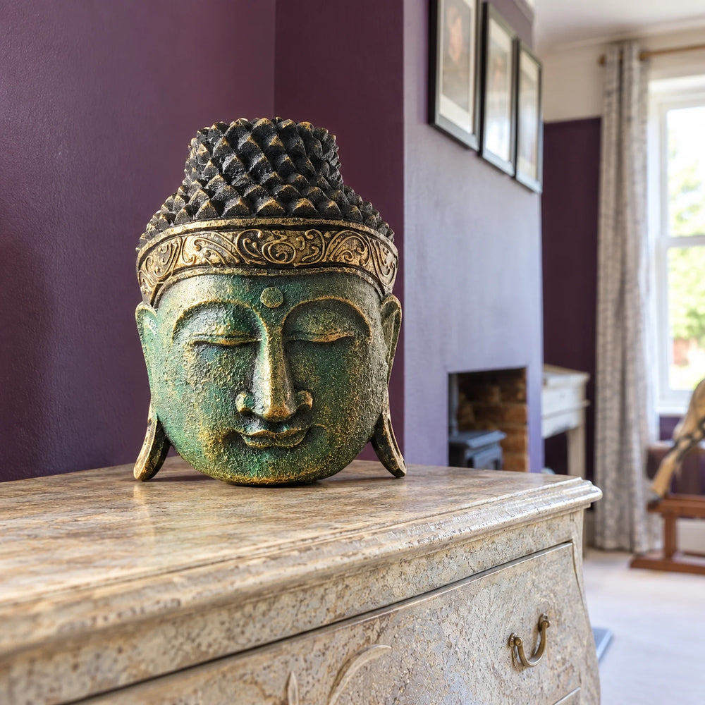
Choosing a finish for a Buddha head is partly a question of what you enjoy looking at. The same colour can appear different beside another wall colour or under another lamp. Treat the ideas below as styling suggestions, not tested rankings of which finish is calmest, most popular or most traditional.
Look at sheen as well as colour
A glossy finish can catch highlights and reflections that a matt finish does not show in the same way. How noticeable that is depends on the surface, shape, light and viewing angle; gold and silver do not automatically change more than every coloured finish.
Compare the listing’s photographs, but remember that your screen and the photography lighting affect the impression. If an exact colour match is important, ask for clarification before ordering.
Gold-coloured finishes
A gold-shine option may appeal if you enjoy warm metallic accents beside wood, cream or terracotta. That is an aesthetic pairing to consider, not a rule for south-facing rooms. Check the stated material: “gold” in a colour name does not mean the object is made of gold.
Do not use the finish alone to decide whether a modern decorative object is appropriate for Buddhist practice. The figure, context and practitioner’s preferences matter.
Silver-coloured finishes
A silver-shine option can repeat an existing cool-toned accent, such as a frame or fitting. It can also provide contrast in a warmer scheme. It is not automatically the quietest or safest choice: a bright highlight may stand out strongly against a dark wall.
Blue and green
A blue-shine option could connect with blue textiles or a painted wall. A green-shine option could echo foliage or a botanical print. Try repeating a colour you already like rather than assuming either colour will make everyone feel calmer.
Green beside plants is a visual suggestion, not permission to put the object somewhere damp, hot or exposed to direct sun. Check the care and placement information for the specific product.
Red
A red-shine option can become a deliberate accent against neutral surroundings or sit among other strong colours. Whether it feels lively, restful or distracting is personal. There is no universal ban on red in a bedroom or requirement to use it in a hallway.
A simple comparison in your room
- Choose the intended surface and measure the available space.
- Look at the wall, nearby furniture and textiles in daylight and under the lamps you actually use.
- Decide whether you want the head to blend into that palette or stand apart.
- Compare finish photographs with that aim in mind, while allowing for screen and lighting differences.
- Check the current product description for material, dimensions, availability and care before ordering.
Room orientation can affect the light, but a compass direction alone cannot tell you which colour to buy. Curtains, windows, nearby surfaces and electric lighting also change what you see. Nor does a conservatory or garden room automatically suit a finish just because the colour looks appealing there.
Questions people ask
Which colour is most traditional?
There is no useful universal ranking for these modern decorative finishes. Do not infer religious meaning or suitability from colour alone.
Which finish works in a grey room?
You could repeat cool tones with silver or blue, or choose a warmer contrast. Pick the relationship you prefer rather than treating one answer as correct.
Which colour is best in a dark room?
Compare it under your actual lamps. No finish removes the need to consider available light.
Does a colour name establish the material?
No. Read the material specification separately, especially for metallic-looking finishes.